CalPERS
California’s Retirement System
Over 2 Million Users on One Platform.
About CalPERS
The California Public Employees’ Retirement System is a state agency that manages pension and health benefits for more than 1.5 million California public employees, retirees, and their families.
Retirement Application Re-design
The CalPERS application is designed to assist the state’s public employees with access to their medical and retirement information. As the lead UX designer, I managed a team of designers to update and streamline the myCalPERS online retirement application for active members, retirees, employers and business partners. An effort was made to create a responsive UI and a request was made to create a mobile application for users to manage their retirement via mobile device.
Overall, an 8 hour process of retirement was reduce by guiding the user to the required information needed to process their retirement quickly and with more clarity.
The Approach
-
Provided interaction design on my|CalPERS member and mobile applications
-
Lead discovery, planning and research identifying and documenting user types, user stories and usability testing and validation
-
Managed the UX group that developed the user-centric design
-
Served as the advocate for the end user to ensure all designs were usable, intuitive, and conform to industry standards
-
Evaluated and designed interaction wireframes to depict workflow, including diagrams to communicate to developers, analysts, and other stakeholders during the design process
-
Created user requirements and functional requirements to validate user goals and task flows
-
Defined and documented interface designs for Section 508 compliance
The Result
The nation’s largest public pension fund, CalPERS serves more than 2 million members in the retirement system and more than 1.5 million members in our health program. By creating a friendly and intuitive interface, CalPERS increased customer satisfaction by allowing users to serve themselves.
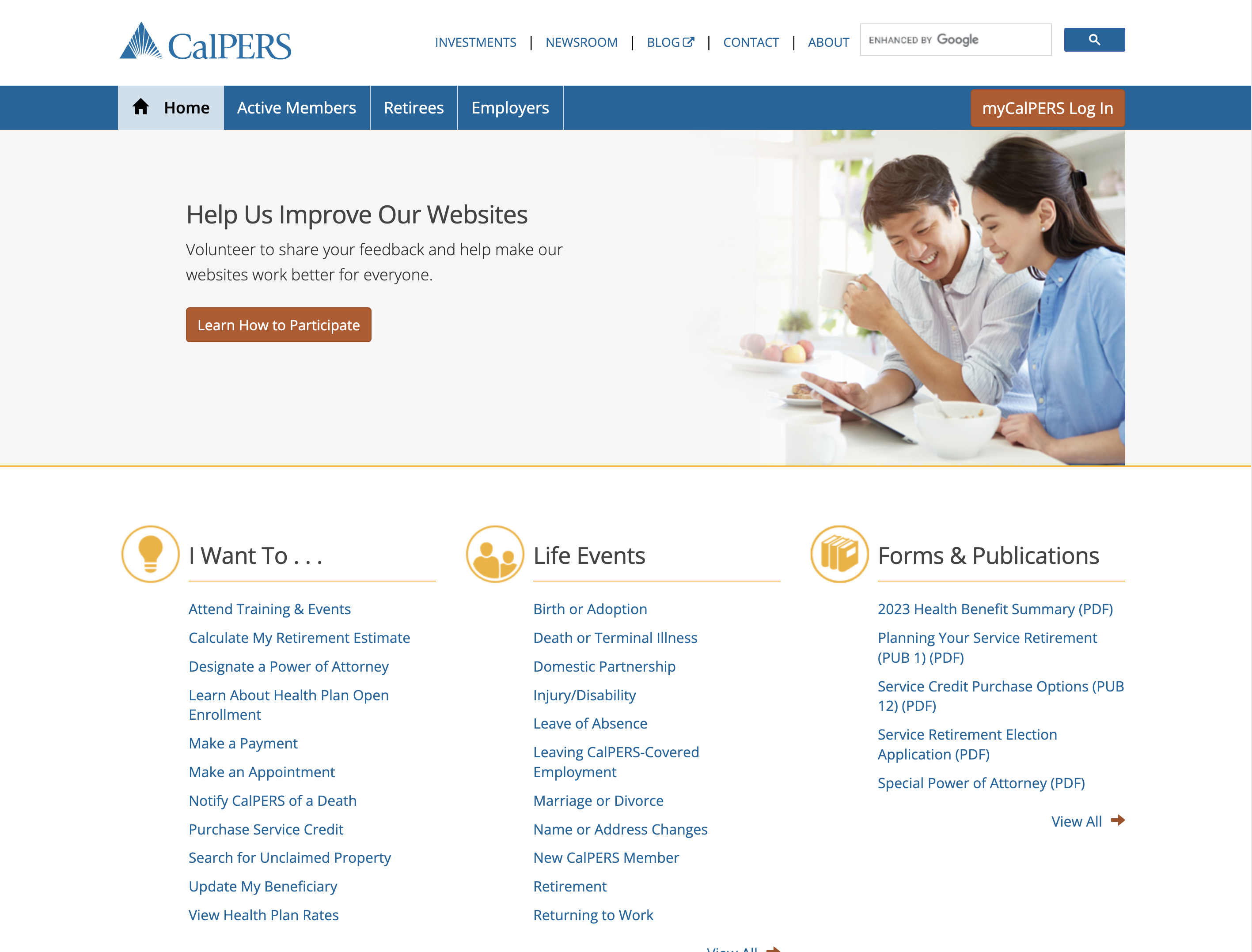
The current UI uses components and repurposes them to provide a clean look that is consistent with their brand. The new user interface allows the user to select a workflow path to self-server based on the user’s need.
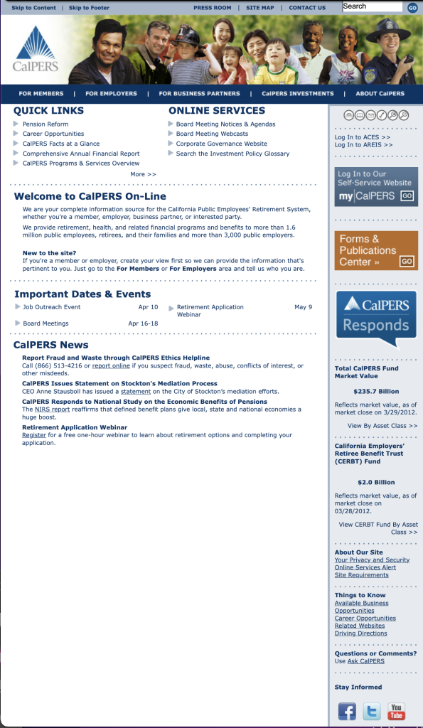
The older UI is outdated and required the user to search and read for a solution to their concern. The main funtion of the site is to have the user to login to myCalPERS.com however the button to do so is located to the right of the main display and may be missed.
Do you have any questions?
Let’s zoom and talk about your project!
If you have the time and want to talk about your project I would love to chat with you! You can set up a 30 minute online conference using the button below.

Interested in learning more?
If you are interested in speaking with me about a possible position, select the button below to learn more about my background and download a copy of my resumé.


